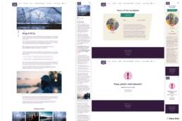
I designed a website for a campaign that encourages parliamentary candidates to commit to ecological principles through a digital pledge.
Client
Finnwatch
Year
2023
My Role
UI Designer
Tools
Adobe PS, AI, XD
Miro, Monday
Initial Problem Discovery
The problem discovery phase was conducted through stakeholder feedback and heuristics. We had previously created a similar website the year before, and the client had received feedback from the candidates. As a result, they were already aware of some improvements that could be made to this version.
The website had to fulfill the following requirements:
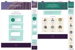
- Candidates: Upload information to create a personal page that they could later share. However, the information needs to be reviewed by the organization before being published.
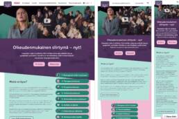
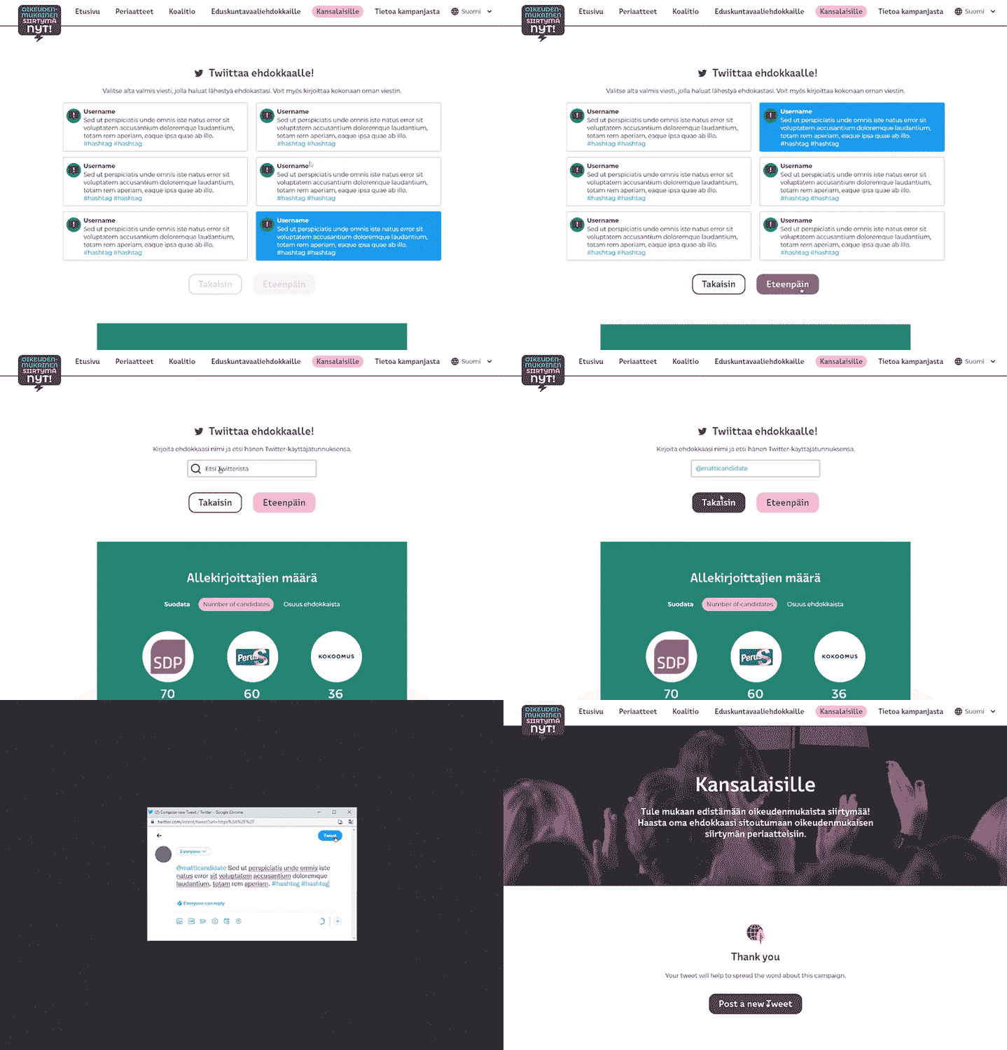
- Users: Users could choose from pre-written tweets to post on their own accounts and direct them to the candidates.
- Time and budget: Both limited, so we had to design with iterations based on experience and also the client also did not have a defined visual identity, so we would have to adapt to it during the project.
Project Goal
Create a user-friendly and informative website for the Ecological Pledge Campaign Oikeudenmukainen siirtymä – nyt!. (A fair transition – Now!) The website was designed to increase awareness of the campaign, make it easy for candidates to share their pledges with voters, and encourage voters to support and interact with candidates who have signed the pledge.
Features
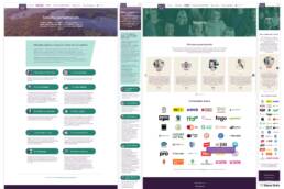
- Responsive design for all devices
- Clear and concise navigation
- Easy-to-use form for candidates
- Pre-filled tweets for voters
- Table and counter of signed pledges
- Social media feed
Target Audience
Voters who are concerned about climate change: Usually young people. They are likely to be more interested in learning more about how this pledge could help address this topic with the candidates.
Media outlets: They can help spread the word about the ecological pledge
Environmentalists: These individuals are already interested in environmental issues, so they are more likely to support a campaign like this.
Candidates: Those who think voters care about environmental issues.
Key Challenges or constraints
Time and budget constraints challenged the project. The site had to be developed well in advance of the election date, and the client’s needs had to be met without increasing the cost. This meant thinking about simplified versions that would meet the project’s objectives.
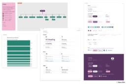
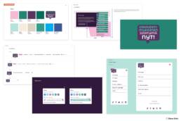
The visual identity was not complete. The identity was not finalized by the time I reached the stage of designing high-fidelity prototypes. Adjustments to colors and graphics were requested without a style guide, so I had to create the interface guide based on what had been sent and fill in the missing information.
Research Study Details
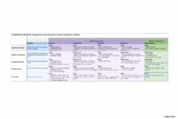
Competitor Analysis. Even though they are not directly competing with each other for profits, they are still competing for the attention and support of donors and volunteers.
Customers. I asked our clients what they like and dislike about the past project, and what they detected that could be improved.
Secondary Research. This included articles, blog posts, etc.
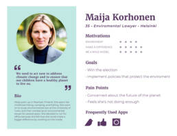
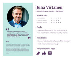
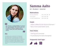
Personas creation. I created these fictional representations based on the information I was given and by doing research.
Design
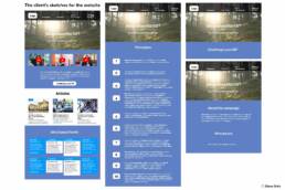
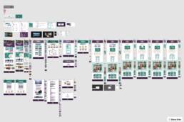
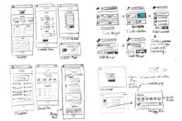
During this stage, I developed wireframes, mockups, and high-fidelity prototypes.
Testing
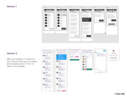
I conducted a heuristic evaluation for the website and user testing to identify usability problems for the Twitter generator section. Heuristic evaluation is a cost-effective usability inspection method, so I used it to identify potential problems. I then tested the Twitter generator with 3 people to get their feedback and identify additional improvements. This allowed me to make changes to the Twitter generator while keeping the project within budget.
In addition, I also received feedback from the client’s team, related to accessibility aspects they detected. This feedback coincided with the heuristic evaluation, and it allowed me to improve the accessibility aspects of the interface.
Insights gained from the project
- The goal of this project was to create a user-friendly and intuitive interface for a new campaign website. I began by conducting a competitive analysis, secondary research, and talking with our clients to identify the needs of the target audience. This information helped me to design an interface that met those needs.
- Although moderated user study testing was not possible due to time and budget restrictions, I applied a heuristic evaluation to identify improvements for the website. This evaluation was a valuable tool for identifying potential usability issues, and it helped to ensure that the website was designed in a way that was easy to use and understand.
